Tuesday 22 March 2016

evaluation


My assignment brief was called Personal project. We had to choose a topic on a social ethical issue.
I think this topic was a good unit because we had to choose a topic within a social ethical issue so we had a lot of free will over this subject because there is so many social ethical issues like Deforestation ,Self-harm, Animal Rights, Eating Disorders, Bullying, Child Abuse and Cyber Bullying these are only a few samples what we could have chosen from.
 I also chose this theme because it is personal to me because people in my family that self-harm so I thought it would be an eye opener to family and friends.  Before I studied self-harm I did not understand why they did it and I used to despise them because why would you do something that effects your health just to cry out for help from other family members. Now I understand it is not what I thought, I know that now it is a mental state that caused this to happen.


The topic I have chosen was self-harm. I chosen this theme because I do not think a lot of people of all ages know what self-harm is truly is about. I want to create a poster that says all that I would like to say and make an informative poster. I also think people take the micky out of something that is such a serious subject and need to know what the subject is about before they speak and I also think adults do not know about this subject as much as they think.


I have researched manga and anime.  The anime that I have researched was called Kuroshitsuji which means Black Butler. The reason I chose to research this because I love the anime and the Victorian era theme and I have also researched monochrome manga and anime for inspiration. I have also research into self-harm and watched a video about it. I found this research was an eye opener because I did not quite understand this subject. I researched into Victorian style patterns and researched into different types of font using dafont. I have also looked at different people's monochrome inspired anime pieces whtch gave me my idea.


I researched the artist Yana Toboso the creator of Black Butler she has done illustration and story for Kuroshitsuji. While I was researching her I found out that she has done some monochrome pieces and I have found researching this artist was very useful. What I love about this artist is that she loves Victorian style clothes and I love her manga stories about demons in the Victorian era.


The research that was very helpful was looking into monochrome because that inspired my design to be in black white and a little colour.  I also found researching Victorian patterns was very useful because it inspired me to make my own patterns.


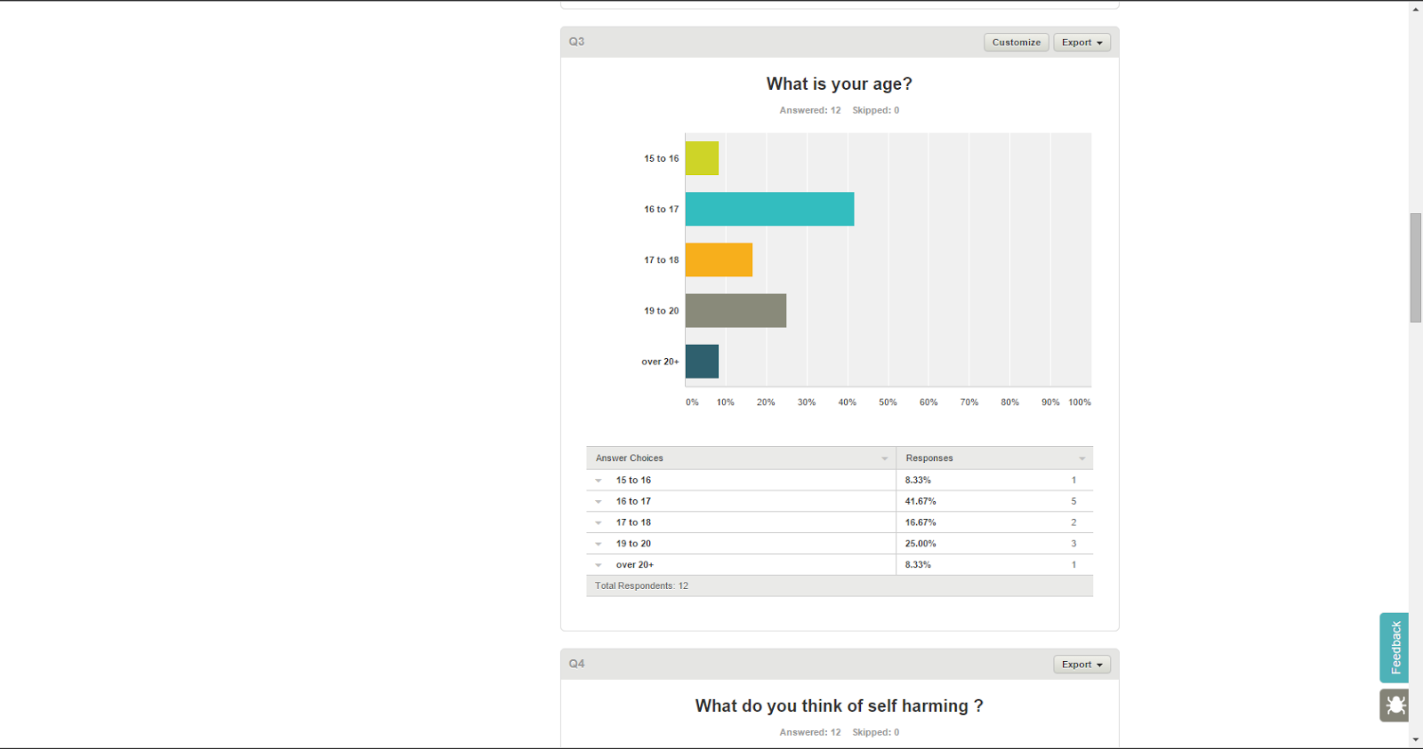
My primary research was doing a survey for people to help me decide on things and find out what their views are and what they know and feel about self-harm. This was very useful and helpful, it helped me decide on which apps to use to create my final piece on.


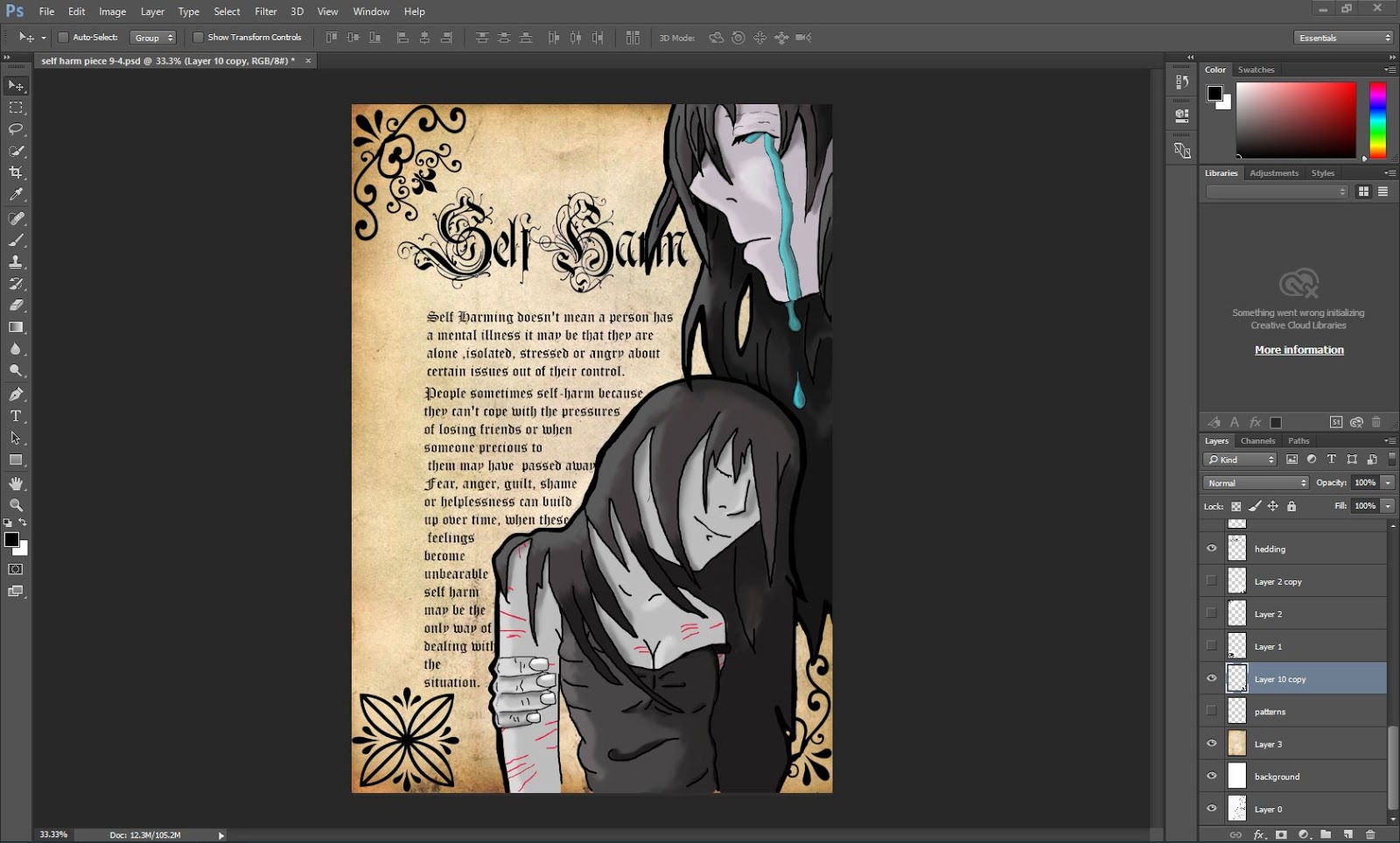
I have made a graphical informative poster about self-harm because self-harm does not get discussed that often. I made this on Photoshop because that is what my survey results said because it Photoshop had the  most votes.


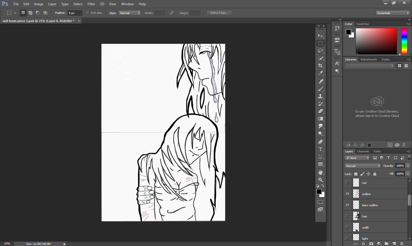
The reason I have chosen the colour scheme because it resembles what I am trying to portray.I chose to have the only colours blue, red and black. I chose black because my theme is really bleak. I chose the blue because it shows the tears and the red because it shows the self-harm marks and makes them more eye catching.  


I  have used only one image from a free background site because it was too time consuming. I got this image by searching in Google free Vintage paper background because if I did not do this I could be sued for copy righting. So that is why you have to put free in front of what you search up on the internet.


I have created my images using Photoshop tools. I have chosen to use a smudge tool because it blends the colours together and makes the colours seem 3D. I have also used the a hard brush tool to create the outline and to block colour my image and then smudge it to blend the two colours together. I have used a custom shape tool to create my patterns, I did this by having my desired custom shape  and used the  pologynal lasso tool to break the shape up and then I rearranged the shape to my liking and doing this created my pattern.


My target audience is 10 years and over. this is  because anyone can self-harm, but the reason I say 10 years and over is because there is more of a risk of self-harm to happen to that age range of people. 


I have developed new skills by learning how to make patterns with the custom shape tool and I have learned how to get free pictures without copy righting I have found that I can use these tools in my future projects.


I have found my time management was not so good with my research task. I kept to the schedule but then I kept on going back and forward with my other research that I had not finished.  Apart from that, my time management has been good. I wish that I have thoroughly planned my schedule properly in my new projects I will do a thorough detailed schedule to go by on.


I am extremely happy with my final piece because it is as my idea and fits my proposal but I have changed a lot of it. In my proposal project I had planned my idea but I have added a lot of new stuff to it to make it better. I have  added patterns and a background intseastd of leaving it white.


If I was to do this project again I would have done a more detaied picture by having a full body picture of both of my characters. I would  also added some rain to the background to bring more meaning to the picture and this would say that the world cries when someone self-harms. I would also hand draw my own patterns instead of breaking up shapes to make a pattern.


 I had a few problems with my piece because the skin colour was too pink so I had to set the layer to grayscale to avoid this happening again. I also had some difficulty with making my own patterns I had overcome this by asking Charlie one of the teachers in our class to help me  with the pattern. She helped me by giving me a 1 to 1 tutorial on how to make easy patterns.  


My presentation went well, I liked the outcome of my presentation because it was simple and clean and well organized. I had created eight slides to show to the teacher and I  added animation to it to make it good and eye catching. The teachers feedback was good ,she said that I do not need to change anything and that I was speaking clearly and I had my power point well presented.  

survey monkey results


What type of research did you do?
I have done quantitive research so I can obtain people's opinions  so I can see what type of information will look good on my poster 


 What type of information did you gather?
I have gathered various information on what creative tool shall I use and what layout I should use and what does self-harm make you feel and what you think self-harm is  I found these questions are very useful and an eye opener on people's views 
Who was your target audience?, Why? my target audience is 15-20 because that is where I think the heart of the subject lies and I think teenagers has a lot to view 
How could this information help improve your personal project? it improves my work by having influenced me on my views of people knowing what self-harm truly means 

Below give a summary of your results: (remember if you have ten responses that mean each answer is worth 10% of your overall feedback.)
Look at your results, what do they say? my results say that I should write a little information on my poster and that I should have it portrait not landscape and do my poster in photoshop and not in illui straighter. 
Summarise the process and evaluate what impact it will have on your personal project 

overall I found that I have to write a little information but with a lot of description so that people who read this is easy to look at but  do not need to take ages reading 
and that a portrait is a lot better for a poster then landscape 

power point

on my first slide, I have created a title for my theme  

the second slide I wrote what did I create and why and answered in small detail so I can talk freely 

I have written my research in simple bullet points 

in this slide, i have created a double blade slide where it is one slide but seems like 2 I have put my inspirations on this course  this is the fist part of the slide
it also shows my inspiration for my final piece 

this is the second side of the slide where it showed I have studied manga and monochrome 
in this slide I have written my idea 

I have put my productions and what I changed 

I wrote how it went 

and final i asked for my peer feed back too see what i could change 
Teacher  feed back : Faye said that my presentation was very good, very clear. nothing bad about the presentation she said but i thnink I could of said a lot more on my final piece.

Tuesday 8 March 2016

black butler reserch

Yana Toboso, artist and story writer 

The Black Butler artist and writer is Yana Toboso. She was born on January 24th 1984 in Warabi, Saitama Prefecture, Japan. She is a Japanese Manga artist, her works are Rust Blaster and Black Butler. 

The manga and anime is called Black Butler and the Japanese name is Kuroshitsuji. 
The manga/anime is about Ceil Phantomhive which is about a 13-year-old boy who is the head of the Phantomhive family. They are a well known family known as 'the queens watch dog' and they have the task of solving mysteries and crimes in the London underworld. Ceil has made a contract with a demon in exchange for his soul. There are 21 books, 109 chapters and 3 seasons of the anime but only 2 seasons are dubbed into the English language and 3 seasons are in subtitles. The publisher is Yen press.


http://j-fair.com/storage/product/575_1_51Xs-bprHeL._SS500__original.jpg
The covers of the manga are not written in number coordination they are set in Roman numerals. 


Here is some of her monochrome artwork.


I like how all of her monochrome work has her characters in the piece. I also like that she has kept to one colour in each art piece.

time table

I have created a time schedule to keep track and evidence what I have done. This will also help me plan what I am going to do and when. It also give me a reminder of the holiday and important events.

Thursday 25 February 2016

Victorian style patterns


My  theme is 'self-harm' and I wanted to put a sub-theme of gothic. I have collected simple black and white patterns wich have a gothic feel


http://www.123rf.com/stock-photo/scroll_angle.html?mediapopup=9717516

I chose this pattern because I like the flow and the detail between the levels I also like that it is a large pattern
http://www.123rf.com/photo_21686068_seamless-victorian-pattern-isolated-on-white.html
I like this because it is  repeated pattern and it is symmetrical it is fairly simple so it will be easy to replicate

http://www.123rf.com/stock-photo/scroll_angle.html?mediapopup=9717516
this is another large pattern and I like the way it is elegant and graceful it is made up of curving twirly lines 
http://emorna.tumblr.com/post/46415771232/research-victorian-patterns
I chose this to use as a centerpiece to my design it is symmetrical horizontal and vertical and  I like the thick black lines it makes it look bold 

https://www.pinterest.com/pin/383157880772389487/
I like this as it is a corner piece which is quite unusual and it has a vertical pattern within the borderline 
https://blogger.googleusercontent.com/img/b/R29vZ2xl/AVvXsEiPXb5K4F9EdptNxnRoW48XLpESMiR59_2SF764clOiJtkIvAPg-jhyphenhypheniEMDNseTkD35iZq-z0yfJ9BI0-jymPblUH1ZcPvi2xXji-lnoJUvrAp65vbFsfKb2_VacaOnPTuVsSjlXdAo75Q/s1600/rose.jpg
this image is of a modern design of a rose and I like the curvy shapes in the pattern 

self harm survey questions

I have chosen these particular questions because I needed peoples opinions on what they think about self-harm and how it has  affected them. I was stuck on the amount of information/text to put on my poster so I decided to ask people which one they prefer, lots of  information or is less more 

Wednesday 24 February 2016

researching font for main heading

This is the font that I have chosen to use on my poster.  I have chosen this font because it is a victorian style font and it goes well with  the theme of my poster. 
I have researched different fonts using Dafont. I used a filter tool to filter the victorian and gothic style. I wanted to do a dark theme because  self-harming in its self is sad.  I am doing my piece monochrome as I wanted to go with a black and white font and imagery.

reserch what causes self harm

http://www.thesite.org/mental-health/self-harm/why-do-people-self-harm-5680.html
   
I watched a video on http://www.nhs.uk/conditions/Self-injury/Pages/Introduction.aspx
it gave me more of an understanding of self-harming. 
Self-harming doesn't mean you have a mental illness it can be that they are alone isolated stressed or angry about certain issues out of their control. These issues may include low self-esteem, poor body image, sexuality, divorce, physical, sexual or emotional abuse, domestic violence and may include many more. 

Both men and women self-harm but in recent years the number of men self-harming has increased.
Young people aged between 15 and 25 years old are more likely to self harm. 
There are some groups of people who are more at risk of self-harming than others, including: Gay, bisexual, transgender men and women,  people who are dependent on alcohol or drugs,  people with learning disabilities.
Drinking alcohol raises the risk of self harming if you are stressed or depressed . 
People sometimes self-harm because they can't cope with the pressures  of losing friends or when someone precious to them may have  passed away. Fear, anger, guilt, shame or helplessness can build up over time, when these feelings become unbearable self harm may be the only way of dealing with the situation.

final piece poster steps

First  I sketched an outline of my figures and then I scanned it into photoshop. I was going to use illustrator but my survey monkey results showed this to be less popular than Photoshop.  this worked well because I am skilled at using Photoshop.
I used the brush tool and black ink as it is the most commonly used to create  anime characters
Next  I block coloured in the hair using a brush tool and then I used a smudge tool to blend the colours together
I repeated the same process to colour the clothes
I used the same processes and tools to create the skin tones
I used a brush tool to create the tears but I did not like the effect on the pale skin tone with the dark blue colour
I decided to change the tears colour to a light blue as it is more effective
I then added the scares by using a pencil tool and changing the colour to red. This made the scars more effective and stand out
I then removed the background and added a plain white background
Next I added the text, I summarised this from my research. I chose the font Rurirania by paul loved that I found on the Dafont website
I added my text from my research and I used text font from photoshop. I chose this font because it goes well with my theme.  I like that it is victorian font style
I produced an example of my poster with corner patterns to see how this would look

 I have removed the template patterns and altered the font size to my liking. I did not like the other font size because of it was too big and took up more space.
 I then added my own patterns to replace the old replica patterns. I made the patterns using a pattern tool and I used a lasso tool to cut the shapes. I used the shape tool to get a shape that I liked and I chopped it into pieces and made my own shape.
And lastly I used a free vintage paper background to make it look more gothic and victorian style.

Tuesday 9 February 2016

reserch monochrome manga

Monochrome is an effect that is black and white and has little aspects of colour involved.
The monochrome effect has inspired me to create my final piece and my design idea. I like the monochrome effect because  it shows up the small amount of colour details.
http://data1.mn12cs.com/2015/05/275546_b995046707143ace2e95772b1a8d77dc.jpg
I like this photograph because it looks good and the character design is unique. I also like that it has only one colour and that it is red.  I  like the textures that you can see on the photograph. 

http://b2.pinger.pl/dc521da990fd4465c9b019b99024c611/79c04386f655ce12b71f4acf0b6705eb.jpg
I like this photo because it is a photograph of Ceil Phantumhive. I am inspired by the costume design and I love the Victorian style clothing. I like the two colours to create the monochrome effect. 

http://s2.favim.com/orig/140830/anime-art-black-and-white-boy-Favim.com-2034202.jpg
I like this monochrome piece because it is Fan Art of Tokyo Ghoul and I chose this because Tokyo Ghoul is one of my favourite manga and anime. I like that the colour is red, black and white. I also like the eye shape and the different shades of red.

http://s5.favim.com/610/141101/anime-boy-beautiful-manga-monochrome-Favim.com-2199547.jpg
I like this image because it is Juuzou from Tokyo Ghoul. I like it because it is line art.  I also like that there is not much detail involved in this piece and that it is a simple piece. 

http://wallpaperswa.com/thumbnails/detail/20120726/blondes%20katana%20bakemonogatari%2
0feathers%20vampires%20oshino%20shinobu%20monochrome%20anime%20anime%20girls%2
01920x_wallpaperswa.com_47.jpg
I chose this piece because the monochrome colour is black, white and yellow and I  like that there is a lot of detail involved in this piece. I found the  background emphasised the character.  I like that this piece is just random. 

https://s-media-cache-ak0.pinimg.com/236x/ec/9f/4b/ec9f4bcf1bd931a2986562251df86d45.jpg
I like this monochrome  design because there are 3 colours involved yellow, green and pink.  I also like the line art on this piece, I like that it is geeky 


https://media.giphy.com/media/dCsDwPtjBWFz2/giphy.gif
I like the different shades of grey and the different shades of red. I also like the broken pieces of skin and how it has broken away from the body and that you have a gap and you can see the heart. I also like that the detail on the heart and  like that the hands are someone else's. I believe that it is the makers hands because he looks like a puppet. 

http://41.media.tumblr.com/3f1bce2d47db13fa54c256dbc4cff409/tumblr_mv45tokrNP1sib6cro2_250.png
I like this monochrome piece because it is from Black Butler and that it is Claude from Black Butler II.  The pattern that is in the background  inspired me to put patterns on my final piece. 
http://25.media.tumblr.com/5d4e1c9e0c6d59349ed909136a907133/tumblr_mujmlcOfg51sib6cro1_500.png
I like this monochrome piece because it has Sebastian and Ceil from Black Butler. I was inspired by the monochrome style where the only colours are red and purple. If I was to do it myself I would do his hand pattern purple as it is in the Black Butler anime. I also like the posture and the style of clothes. I like how it has the odd purple in Ceil Phantumhive's eye.
http://24.media.tumblr.com/7f6afc1110a4ac0de7114c7b76bb19fc/tumblr_musr1pTkQ31sib6cro1_500.png
I like this piece because it is Ceil and it is a shocking moment in Black Butler manga and anime. I like that the only colour is red and I also like the detail of the suit.  

http://data.whicdn.com/images/58624987/large.png
I like this monochrome piece because  I feel that there has not been much thought put into it and it's a very simple style of monochrome.

http://vignette1.wikia.nocookie.net/yakuza-mob-roleplay/images/e/ed/Red-eyes-lying-down-monochrome-roses-anime-girls-wide.jpg/revision/latest/scale-to-width-down/2000?cb=20150327025338
I love the detailed part of this monochrome piece because the roses look real but anime at the same time. The skin tone's are really good,  I also love that the only bright colour is red.
http://media.tumblr.com/c85ac0ebfeba41023ef0cd93ca340b37/tumblr_inline_n2lvokj1nI1req2if.png
I like this piece because it is mainly black and white. I like that there is only one small ounce of red in this piece.

https://41.media.tumblr.com/93a4da7cae9b622bb20d755a079fde35/tumblr_misw9wbnT01rswgpxo1_500.png
I love this piece a lot because  it fits in my theme of self-harm. As you can see the woman is holding a scalpel and that she has cut her throat and the blood is actually flowers not blood. I like that the flowers are red to symbolise the blood. I also love the emotion that this piece conveys. I really like the skin tone, I think this piece is truly emotional and very sad because she is crying.

http://40.media.tumblr.com/ca3ed2e3788c22a7048f3bec974a12d6/tumblr_mv45tokrNP1sib6cro1_500.png
I like this piece because it is from Black Butler. I like that the symbol in the background  is purple and I like the style of the pattern.


tumblr_mvwkg0Tl871s19ytdo1_500
I like this piece because of the detail on the eyes  and I also like the multiple colours in her eyes.