Thursday 25 February 2016

Victorian style patterns


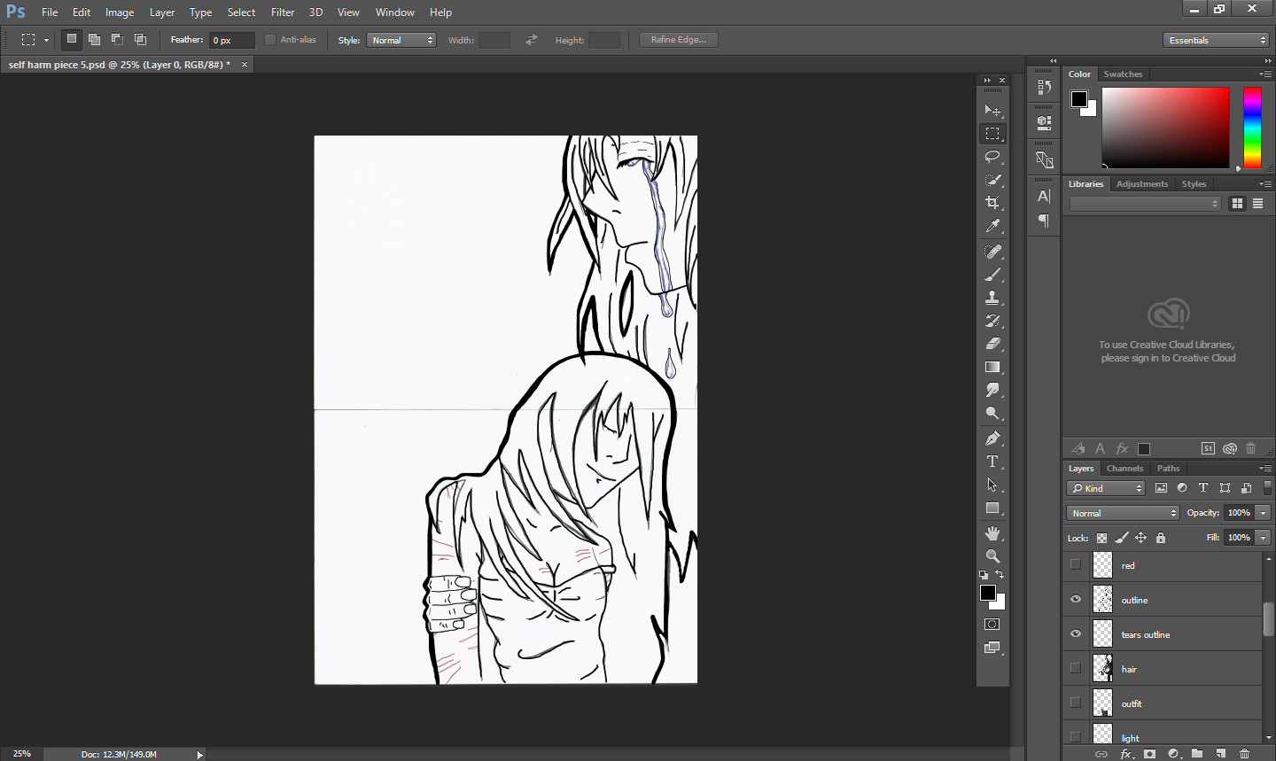
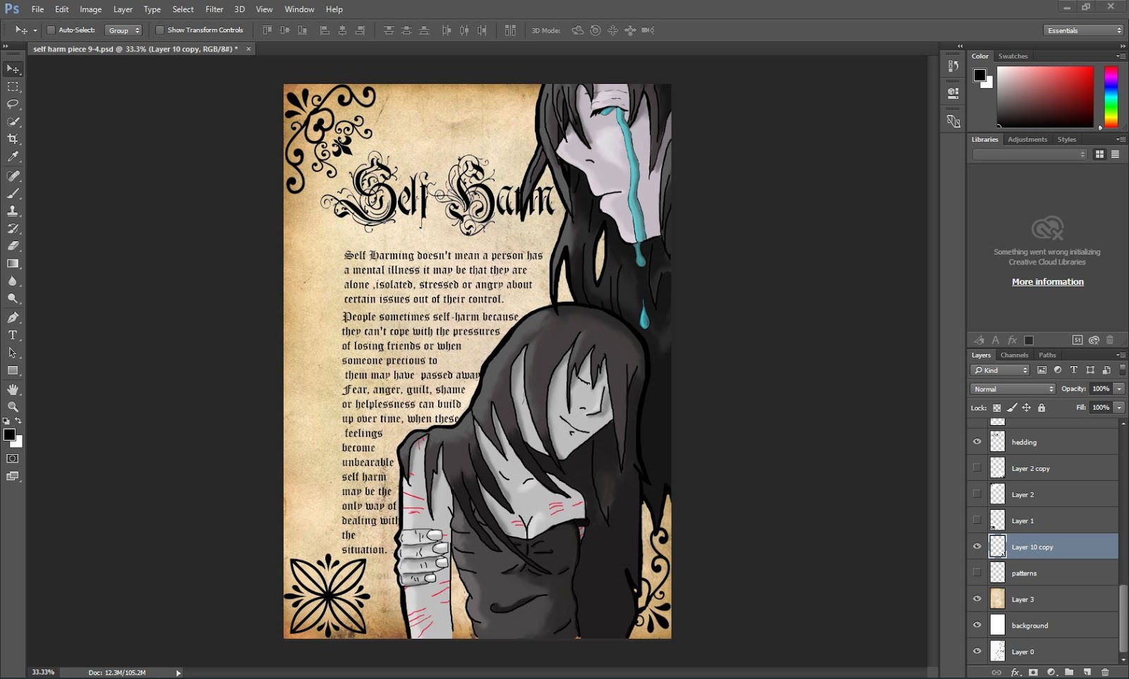
My  theme is 'self-harm' and I wanted to put a sub-theme of gothic. I have collected simple black and white patterns wich have a gothic feel


http://www.123rf.com/stock-photo/scroll_angle.html?mediapopup=9717516

I chose this pattern because I like the flow and the detail between the levels I also like that it is a large pattern
http://www.123rf.com/photo_21686068_seamless-victorian-pattern-isolated-on-white.html
I like this because it is  repeated pattern and it is symmetrical it is fairly simple so it will be easy to replicate

http://www.123rf.com/stock-photo/scroll_angle.html?mediapopup=9717516
this is another large pattern and I like the way it is elegant and graceful it is made up of curving twirly lines 
http://emorna.tumblr.com/post/46415771232/research-victorian-patterns
I chose this to use as a centerpiece to my design it is symmetrical horizontal and vertical and  I like the thick black lines it makes it look bold 

https://www.pinterest.com/pin/383157880772389487/
I like this as it is a corner piece which is quite unusual and it has a vertical pattern within the borderline 
https://blogger.googleusercontent.com/img/b/R29vZ2xl/AVvXsEiPXb5K4F9EdptNxnRoW48XLpESMiR59_2SF764clOiJtkIvAPg-jhyphenhypheniEMDNseTkD35iZq-z0yfJ9BI0-jymPblUH1ZcPvi2xXji-lnoJUvrAp65vbFsfKb2_VacaOnPTuVsSjlXdAo75Q/s1600/rose.jpg
this image is of a modern design of a rose and I like the curvy shapes in the pattern 

self harm survey questions

I have chosen these particular questions because I needed peoples opinions on what they think about self-harm and how it has  affected them. I was stuck on the amount of information/text to put on my poster so I decided to ask people which one they prefer, lots of  information or is less more 

Wednesday 24 February 2016

researching font for main heading

This is the font that I have chosen to use on my poster.  I have chosen this font because it is a victorian style font and it goes well with  the theme of my poster. 
I have researched different fonts using Dafont. I used a filter tool to filter the victorian and gothic style. I wanted to do a dark theme because  self-harming in its self is sad.  I am doing my piece monochrome as I wanted to go with a black and white font and imagery.

reserch what causes self harm

http://www.thesite.org/mental-health/self-harm/why-do-people-self-harm-5680.html
   
I watched a video on http://www.nhs.uk/conditions/Self-injury/Pages/Introduction.aspx
it gave me more of an understanding of self-harming. 
Self-harming doesn't mean you have a mental illness it can be that they are alone isolated stressed or angry about certain issues out of their control. These issues may include low self-esteem, poor body image, sexuality, divorce, physical, sexual or emotional abuse, domestic violence and may include many more. 

Both men and women self-harm but in recent years the number of men self-harming has increased.
Young people aged between 15 and 25 years old are more likely to self harm. 
There are some groups of people who are more at risk of self-harming than others, including: Gay, bisexual, transgender men and women,  people who are dependent on alcohol or drugs,  people with learning disabilities.
Drinking alcohol raises the risk of self harming if you are stressed or depressed . 
People sometimes self-harm because they can't cope with the pressures  of losing friends or when someone precious to them may have  passed away. Fear, anger, guilt, shame or helplessness can build up over time, when these feelings become unbearable self harm may be the only way of dealing with the situation.

final piece poster steps

First  I sketched an outline of my figures and then I scanned it into photoshop. I was going to use illustrator but my survey monkey results showed this to be less popular than Photoshop.  this worked well because I am skilled at using Photoshop.
I used the brush tool and black ink as it is the most commonly used to create  anime characters
Next  I block coloured in the hair using a brush tool and then I used a smudge tool to blend the colours together
I repeated the same process to colour the clothes
I used the same processes and tools to create the skin tones
I used a brush tool to create the tears but I did not like the effect on the pale skin tone with the dark blue colour
I decided to change the tears colour to a light blue as it is more effective
I then added the scares by using a pencil tool and changing the colour to red. This made the scars more effective and stand out
I then removed the background and added a plain white background
Next I added the text, I summarised this from my research. I chose the font Rurirania by paul loved that I found on the Dafont website
I added my text from my research and I used text font from photoshop. I chose this font because it goes well with my theme.  I like that it is victorian font style
I produced an example of my poster with corner patterns to see how this would look

 I have removed the template patterns and altered the font size to my liking. I did not like the other font size because of it was too big and took up more space.
 I then added my own patterns to replace the old replica patterns. I made the patterns using a pattern tool and I used a lasso tool to cut the shapes. I used the shape tool to get a shape that I liked and I chopped it into pieces and made my own shape.
And lastly I used a free vintage paper background to make it look more gothic and victorian style.

Tuesday 9 February 2016

reserch monochrome manga

Monochrome is an effect that is black and white and has little aspects of colour involved.
The monochrome effect has inspired me to create my final piece and my design idea. I like the monochrome effect because  it shows up the small amount of colour details.
http://data1.mn12cs.com/2015/05/275546_b995046707143ace2e95772b1a8d77dc.jpg
I like this photograph because it looks good and the character design is unique. I also like that it has only one colour and that it is red.  I  like the textures that you can see on the photograph. 

http://b2.pinger.pl/dc521da990fd4465c9b019b99024c611/79c04386f655ce12b71f4acf0b6705eb.jpg
I like this photo because it is a photograph of Ceil Phantumhive. I am inspired by the costume design and I love the Victorian style clothing. I like the two colours to create the monochrome effect. 

http://s2.favim.com/orig/140830/anime-art-black-and-white-boy-Favim.com-2034202.jpg
I like this monochrome piece because it is Fan Art of Tokyo Ghoul and I chose this because Tokyo Ghoul is one of my favourite manga and anime. I like that the colour is red, black and white. I also like the eye shape and the different shades of red.

http://s5.favim.com/610/141101/anime-boy-beautiful-manga-monochrome-Favim.com-2199547.jpg
I like this image because it is Juuzou from Tokyo Ghoul. I like it because it is line art.  I also like that there is not much detail involved in this piece and that it is a simple piece. 

http://wallpaperswa.com/thumbnails/detail/20120726/blondes%20katana%20bakemonogatari%2
0feathers%20vampires%20oshino%20shinobu%20monochrome%20anime%20anime%20girls%2
01920x_wallpaperswa.com_47.jpg
I chose this piece because the monochrome colour is black, white and yellow and I  like that there is a lot of detail involved in this piece. I found the  background emphasised the character.  I like that this piece is just random. 

https://s-media-cache-ak0.pinimg.com/236x/ec/9f/4b/ec9f4bcf1bd931a2986562251df86d45.jpg
I like this monochrome  design because there are 3 colours involved yellow, green and pink.  I also like the line art on this piece, I like that it is geeky 


https://media.giphy.com/media/dCsDwPtjBWFz2/giphy.gif
I like the different shades of grey and the different shades of red. I also like the broken pieces of skin and how it has broken away from the body and that you have a gap and you can see the heart. I also like that the detail on the heart and  like that the hands are someone else's. I believe that it is the makers hands because he looks like a puppet. 

http://41.media.tumblr.com/3f1bce2d47db13fa54c256dbc4cff409/tumblr_mv45tokrNP1sib6cro2_250.png
I like this monochrome piece because it is from Black Butler and that it is Claude from Black Butler II.  The pattern that is in the background  inspired me to put patterns on my final piece. 
http://25.media.tumblr.com/5d4e1c9e0c6d59349ed909136a907133/tumblr_mujmlcOfg51sib6cro1_500.png
I like this monochrome piece because it has Sebastian and Ceil from Black Butler. I was inspired by the monochrome style where the only colours are red and purple. If I was to do it myself I would do his hand pattern purple as it is in the Black Butler anime. I also like the posture and the style of clothes. I like how it has the odd purple in Ceil Phantumhive's eye.
http://24.media.tumblr.com/7f6afc1110a4ac0de7114c7b76bb19fc/tumblr_musr1pTkQ31sib6cro1_500.png
I like this piece because it is Ceil and it is a shocking moment in Black Butler manga and anime. I like that the only colour is red and I also like the detail of the suit.  

http://data.whicdn.com/images/58624987/large.png
I like this monochrome piece because  I feel that there has not been much thought put into it and it's a very simple style of monochrome.

http://vignette1.wikia.nocookie.net/yakuza-mob-roleplay/images/e/ed/Red-eyes-lying-down-monochrome-roses-anime-girls-wide.jpg/revision/latest/scale-to-width-down/2000?cb=20150327025338
I love the detailed part of this monochrome piece because the roses look real but anime at the same time. The skin tone's are really good,  I also love that the only bright colour is red.
http://media.tumblr.com/c85ac0ebfeba41023ef0cd93ca340b37/tumblr_inline_n2lvokj1nI1req2if.png
I like this piece because it is mainly black and white. I like that there is only one small ounce of red in this piece.

https://41.media.tumblr.com/93a4da7cae9b622bb20d755a079fde35/tumblr_misw9wbnT01rswgpxo1_500.png
I love this piece a lot because  it fits in my theme of self-harm. As you can see the woman is holding a scalpel and that she has cut her throat and the blood is actually flowers not blood. I like that the flowers are red to symbolise the blood. I also love the emotion that this piece conveys. I really like the skin tone, I think this piece is truly emotional and very sad because she is crying.

http://40.media.tumblr.com/ca3ed2e3788c22a7048f3bec974a12d6/tumblr_mv45tokrNP1sib6cro1_500.png
I like this piece because it is from Black Butler. I like that the symbol in the background  is purple and I like the style of the pattern.


tumblr_mvwkg0Tl871s19ytdo1_500
I like this piece because of the detail on the eyes  and I also like the multiple colours in her eyes.

idea

my idea is that i am am going to draw a anime characters of a mother holding her teenager in her arms while she is crying and the daughter is ganna have cuts on her body in monochrome and the only colors are black and white red and blue and i am going to put the mothers tears blue and the scars of the girl in red and cuts in red

Thursday 4 February 2016

proposal

I intend to produce a digital art piece based on self harm.
I have chosen this particular social issue as i feel it will be beneficial to promote awareness on this subject.
I have found that people are to quick to judge on issues such as self harm.
I think that if they know more about the problem then  they  may be more understanding and supportive and aware of the subject.
I would like my art piece to promote awareness of the issue and also possibly show the wider effect of self harming.
e.g parents and socially
 I am considering producing my digital art piece on Photoshop and illustrator.
I intend to use illustrator to crate my line art of my drawing and then i will use Photoshop to add the blue and the red colors.
I will then add the text and once i have experimented and found one that suits.
Finally i will add my headings witch will be in a bold word format.

I intend to crate a questionnaire for people to complete to provide feedback on my work.
The questionnaire will consist of questions such as ;
how dose my poster make you feel?
is my poster informative enough?
could any improvements be made?

I will evaluate the feedback from my questionnaire and make any amendments needed.

I feel my poster will look its best on white A3 card.
I intend to mount the poster onto a slightly larger black card to crate a black boarder to contrast against the white of my poster background.
I will also present my initial poster idea onto A4 card to show progression from my initial idea to my final design